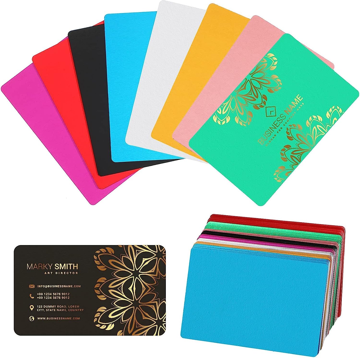
Metal business cards are gorgeous. They’re also weirdly easy to mess up.
A QR code that scans on a screen or on paper can fall apart on metal because metal loves doing the two things scanners hate most: reflecting light and blurring edges. So if your goal is “people actually scan this,” you’re not designing a card. You’re designing a tiny, durable machine-readable target that happens to look like a business card.
One line to keep you honest: the QR code is the product; the card is the packaging.
The real problem you’re solving (and it’s not durability)
Look, durability is table stakes. The friction you’re fighting is scan anxiety: that awkward half-second where someone points their phone, nothing happens, they tilt it, glare blooms across the code, and the moment dies.
A metal business card with QR code works when it:
– reads instantly as a scannable code (not “cool pattern”)
– survives fingerprints and pocket wear without turning into a shiny smudge-board
– scans fast under mediocre lighting (conference halls are brutal)
– doesn’t require the recipient to “learn” where to aim their camera
That’s the bar. Anything less and you’ve basically paid extra money for a conversation stopper.
Hot take: polished metal is a QR-code killer.
Polished stainless looks expensive right up until it reflects a ceiling light straight into the camera and your QR turns into a white rectangle.
If you want scan reliability, you want controlled light. Matte, satin, or fine brush. Low specular reflection. Consistent tone. Predictable contrast.
Now, this won’t apply to everyone, but if your brand absolutely demands gloss, you’ll need to carve out a matte “scan window” just for the QR area. I’ve seen brands try to muscle through with deeper engraving instead. It usually fails in the real world.
Metal choice: vibe matters, but manufacturing matters more
People obsess over stainless vs brass like it’s a personality quiz. It’s not. It’s a production decision with branding consequences.
Quick-and-useful guidance
– Stainless steel: tough, premium, resists bending. Laser marking is common and consistent. Heavier in-hand (some people love that).
– Aluminum: lighter, easier to handle, often cheaper. Can scratch/dent depending on thickness and finish. Great if you’re mailing lots of cards.
– Brass: warm, “legacy premium” feel. Patina is real; your pristine QR contrast might not stay pristine unless you plan for aging.
In my experience, stainless with a matte or brushed face is the least dramatic path to “it scans every time.”
The finish is where scanning lives or dies
A QR code doesn’t need artistry. It needs edges. Sharp module edges. Clear finder patterns. No visual noise.
If you take nothing else from this article, take this: your finish should reduce glare and preserve edge clarity.
Finishes that tend to behave
– Fine brushed (directional texture can work great if the code sits cleanly on it)
– Matte PVD (nice when done well; test coatings for glare)
– Bead-blasted (can be excellent, but too rough and you start losing crispness)
Finishes that regularly betray you
– Mirror polish
– Highly glossy clear coats over the QR area
– Anything with “sparkle” texture or heavy grain that competes with the code’s grid
And yes, coatings can protect. They can also create a reflective layer that wrecks scanning. Test before you commit.
QR code design for metal: stop getting fancy
You can style a QR code. You just can’t style it carelessly on metal.
Here’s the specialist briefing version:
– Keep the quiet zone intact (the blank margin around the code). Don’t fill it with texture, lines, logos, or “design elements.”
– Use high contrast. Phones decode contrast, not vibes.
– Don’t distort module shapes. Rounded modules can work on paper; on metal they often degrade under glare.
– Prefer larger module size over “tiny elegant QR.” Metal production tolerances are real.
A lot of people ask for “deep engraving” because it looks luxurious. Here’s the thing: deep engraving creates shadows and bevel highlights that change with angle. That means the phone sees shifting patterns. Shallow, crisp marking usually wins.
Placement: corner is good… until it isn’t
Most of the time, a corner placement is ideal because it’s predictable and quick to aim at. But don’t place it where the card is most likely to get:
– rounded edges from finishing
– thumb smears from how people hold the card
– scratches from sliding into wallets
I like lower right or upper right if the card’s handed over in a standard orientation. (Yes, people have “hand-over habits.” Watch a few exchanges and you’ll see it.)
Keep the QR on a flat, uninterrupted plane. If the surface curves, bevels, or transitions finishes near the code, you’re asking for distortion and glare gradients.
One-line rule: give the QR a clean stage.
Typography on metal: you don’t get subtle for free
Metal doesn’t do “delicate” kindly. Thin strokes vanish. Tight tracking fills in. Tiny text becomes a shimmering suggestion depending on the light.
Go with:
– sturdy sans serif typefaces
– generous spacing
– clear hierarchy (name reads first, role second, everything else after)
And please don’t cram. White space is not wasted space on metal; it’s what makes the engraving legible when the light is bad and the card is moving in someone’s hand.
The CTA near the code: short, specific, no mystery
A QR code without a cue is a social gamble. People don’t like gambling in networking situations.
Use a CTA that tells them what they get:
“Save my contact” beats “Scan me.”
“View portfolio” beats “Learn more.”
“Get a quote” beats “Visit website.”
Keep it close to the QR but not crowding the quiet zone. You’re guiding the eye, not building a collage.
(Also: punctuation can get noisy on etched metal. You don’t need three exclamation points to sound confident.)
One stat, because it’s useful context
QR scanning isn’t niche anymore. In 2023, around 89 million smartphone users in the U.S. scanned a QR code, and projections expected that number to keep rising. Source: Statista (U.S. QR code scanner users 2020, 2025).
So yes, people will scan. They just won’t fight your reflective finish to do it.
Testing: treat it like hardware, not graphic design
This is where most metal QR card projects go off the rails: they approve a proof under perfect studio lighting and never test the ugly scenarios.
Test like a skeptic.
A practical test matrix (simple but brutal)
– Lighting: bright overhead (office), warm dim (bar), outdoor sun, indirect daylight
– Phones: iPhone + at least one mid-range Android (camera processing differs)
– Angles: straight-on, 15°, 30° tilt
– Distance: “polite scan” distance (about 8, 12 inches) and “lazy scan” distance (18, 24 inches)
Take photos of failures. Note what kind of failure it is. Glare washout? Edge blur? Quiet zone contamination? Each one points to a different fix.
In production, document the tolerances you learned: engraving method, darkness/mark depth, finish spec, and the “do not touch” quiet zone dimensions. Fabricators can hit targets, if you give them targets.
Production realities (a little unglamorous, but decisive)
Your design isn’t final until it can be reproduced consistently.
Decide early:
– laser marking vs etching vs fill/ink
– target contrast level (what “dark” means in actual output)
– acceptable variance across batches
And watch out for edge finishing. A gorgeous chamfer can nibble a QR corner if the code is too close to the perimeter. I’ve seen that happen more than once, and it’s the kind of mistake you only make when you’re designing with your eyes instead of with a scanner.
If you want the “safe” recipe
Not always the sexiest, but it works:
Matte/brushed stainless + high-contrast laser mark + generous quiet zone + corner placement + short CTA.
Make the code bigger than you think you need. Keep the surface calm. Test under trash lighting. Then ship.
That’s how you end up with a metal card that gets scanned instead of admired and pocketed forever.